Toyota Research Institute
Taking automotive to the next level needs a great website.
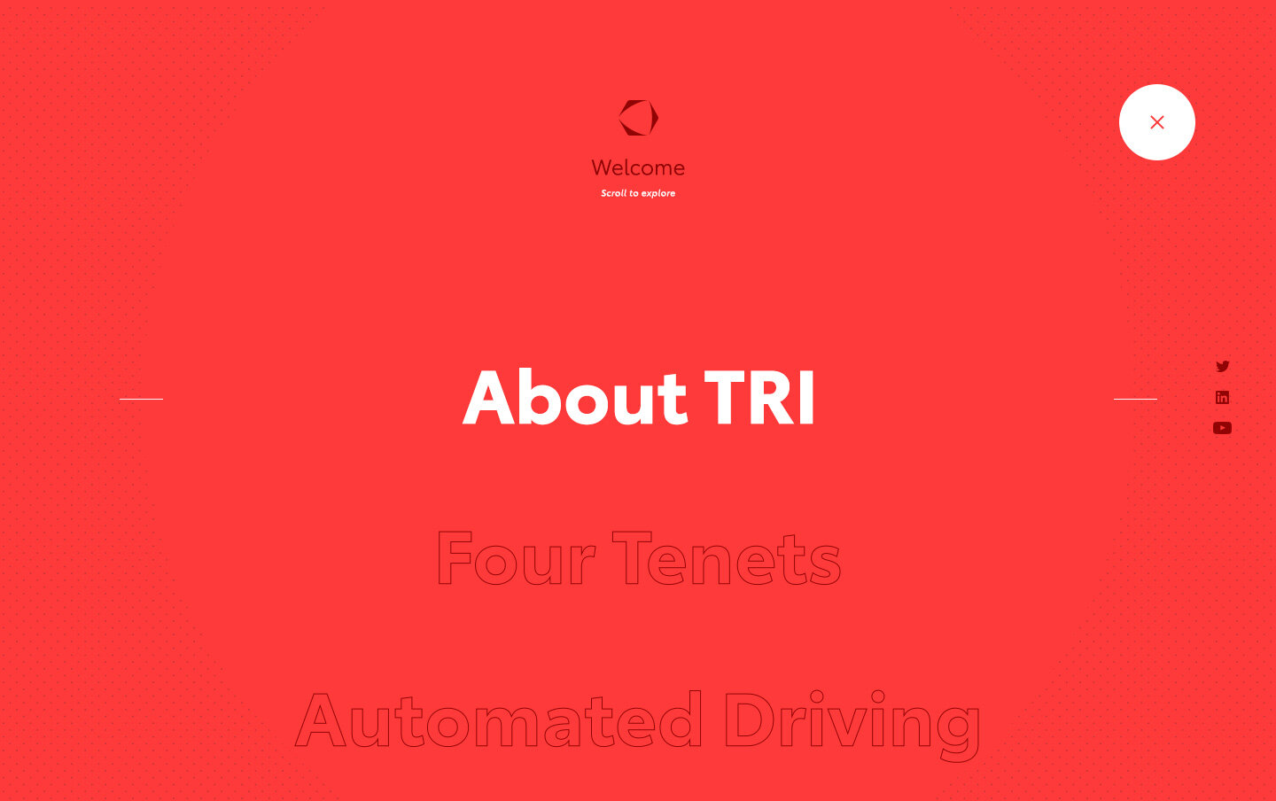
Building from a high-level content map created by the team’s UX designer, my concept for the redesign of the Toyota Research Institute (TRI) website included creating and refining the user experience of the site’s approach, establishing the art direction, and executing the final product in both static and animated forms.
The main goal of my concept was two-fold: get the site’s visitors to their content quickly and minimize the amount of new media the client would need to create and maintain.
ROLE
Art Direction
Visual Design
User Experience
Motion Graphics
Concepting
CLIENT
Toyota Research Institute
Functional yet fashionable
A major consideration for this redesign was the ease for the TRI team to update the site. This led to the decision to make the homepage a very focused, non-scrolling carousel to encourage visitors to navigate through the menu instead of scrolling through content that, most likely, wasn’t what they’re looking for. A constraint that I put on myself was to use media that is public facing to show how creating net new assets wasn’t necessary and all it takes is a shift of perspective with a bit of editing.


