Playdemic
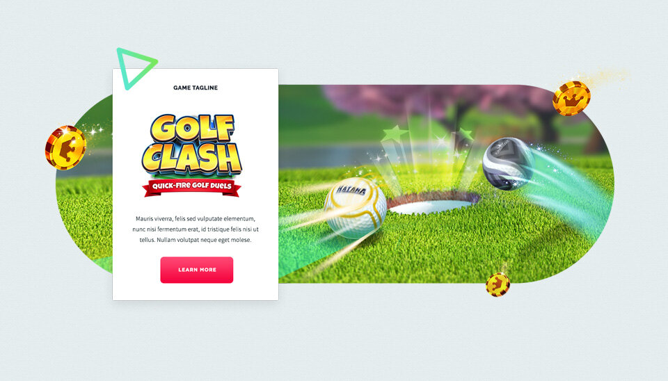
It’s not often you get to work on site with limited restrictions so I decided to take a chance with this initial art direction. In order to leverage the playfulness of their studio, the bright colors of their branding, and the light-heartedness synonymous with casual gaming I leaned into exaggerated geometry and barely confined sections. This would allow the user to seamlessly transition to new content and allow for the components on the page’s top layer to shuffle as needed.
In addition to expanding upon the provided UX and establishing an art direction for the project, the team and I were responsible for creating a custom CMS that was tailored to Playdemic’s needs.
ROLE
Art Direction
Visual Design
User Experience
CLIENT
Playdemic (WB Games)

Not everyone is a maximalist.
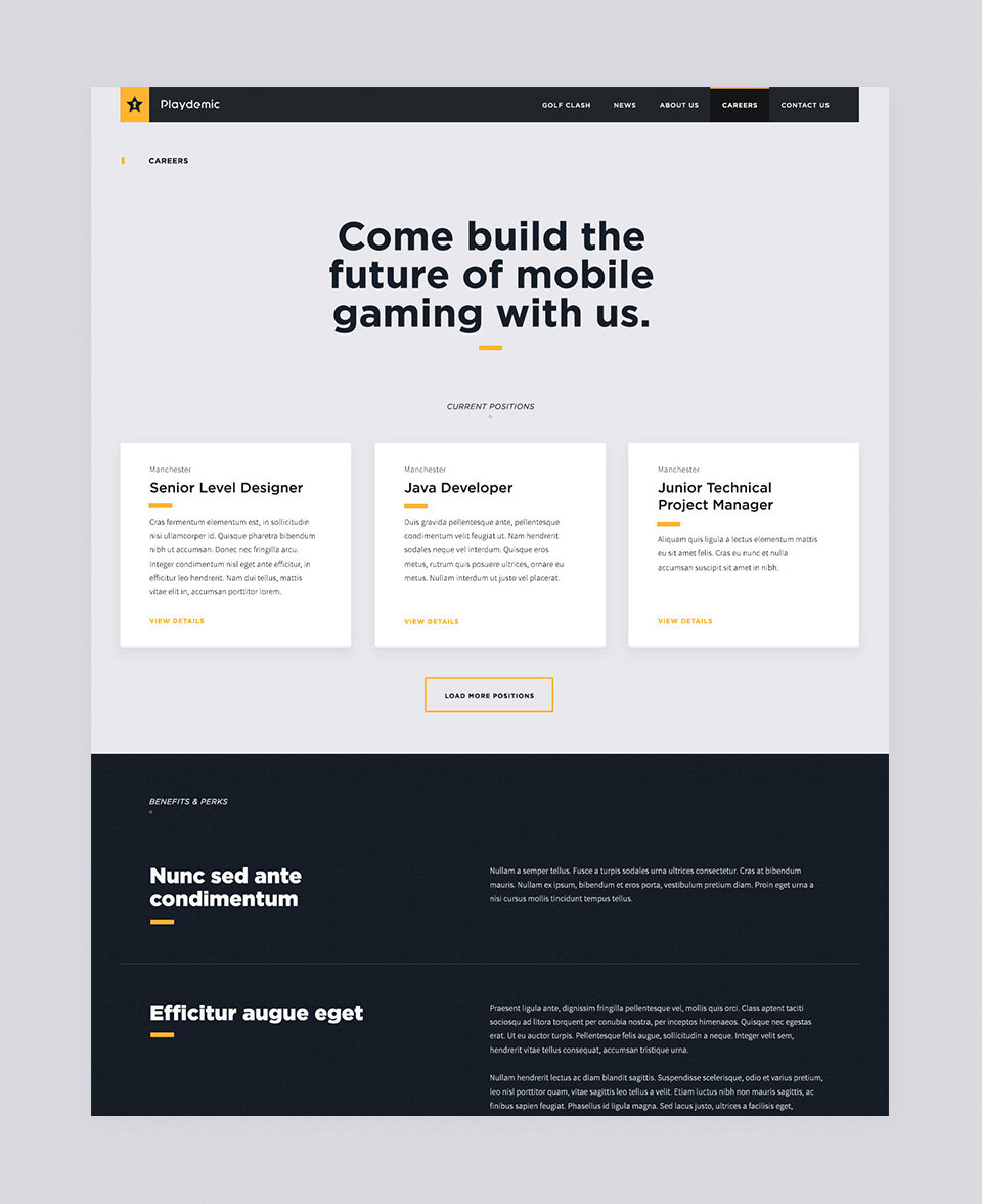
Proposing the bright and overly playful art direction was a gamble from the beginning but if you don’t shoot for it, there’s never a chance. In the next phase, we were able to preserve the functionality and user journey but this time, the visual direction needed to feel more sophisticated or aged up. To do this, we dialed back the colors, shapes, and quirky masks in favor of a darker palette that embraced structure and gave the content more of a chance to shine.


