
Zoom Web Makeover
Bringing news ideas to a household name.
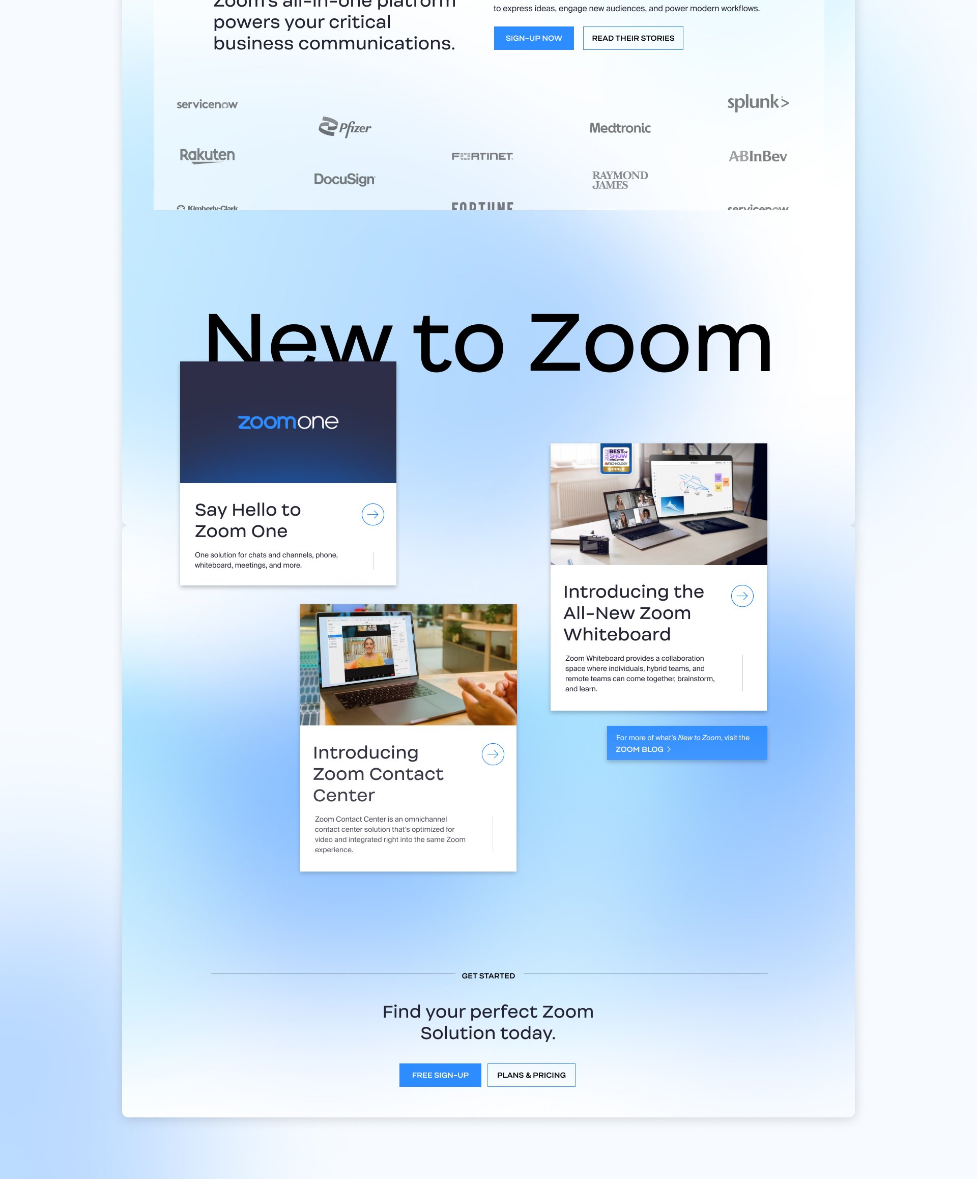
As part of this partnership, I had the chance to reimagine Zoom’s Homepage as well as their Plans and Pricing experience. The team and I we went back to basics and looked at what was necessary, what distracted, and where could we craft a better experience for the user. The end goal of these projects ended up being to create blue-sky ideas that the in-house team at Zoom could pull from when making improvements and performing A/B tests.
For a more granular account of this project’s pieces, let’s talk.
ROLE
Art Direction
Concepting
User Experience
Visual Design
Prototyping
CLIENT
Zoom

First impression. Fresh face.
When we began reimagining Zoom’s homepage, they were still using the legacy branding. This created an opportunity to help ideate on how to evolve the brand without starting over while finding ways to differentiate them from the competition. This was done by proposing a cleaner approach that embraced white space, technical detailing, and a less in-your-face expression of their signature blue.

Plans, Pricing, & Pivots
In conjunction with the homepage exercise, we were asked to rebuild the Plans & Pricing experience from the ground up. Midway through the timeline, priorities shifted when Zoom’s new brand was unveiled. This revelation resulted in a more ambitious, user-influenced vision getting the chop but we were still able to up-level their existing flows, information architecture, and overall page structures.
In it’s early days, the new brand aesthetic leaned almost exclusively into a lighter palette so we chose to go dark and give the client an example of how the brand could be more varied.

